Project Overview
The Product
WildPlate assists in locating the most suitable pet food and ensuring timely delivery. Our user demographic typically spans ages 19 to 80, juggling various life commitments and seeking a streamlined interface. WildPlate aims to simplify and expedite pet food shopping for users of all backgrounds, fostering a conscious and hassle-free experience.
Project Duration
June 2023 – August 2023
The Problem
Available pet food shopping websites have cluttered designs, inefficient product browsing systems, and confusing checkout processes.
The Goal
Design an easily navigable website for the WildPlate Pet Food Delivery brand, offering intuitive user guidance, personalized pet food recommendations, and a straightforward checkout process.
My Role
UX lead – Gonca Onusluel Hepekiz
Responsibilities
Conducting interviews, paper and digital wireframing, low and high-fidelity prototyping, conducting usability studies, accounting for accessibility, iterating on designs, prototyping, and responsive design.
Understanding the User
User Research: Summary
I conducted foundational research and engaged in user interviews, from which I developed empathy maps to gain deeper insights into the target user group and their requirements. Through this process, I uncovered that many target users regard online pet food shopping as a convenient and cost-effective option, particularly when it involves subscription and delivery choices. However, they expressed frustration with the ambiguity and complexity surrounding subscription processes and delivery instructions. This led to a frustrating experience, discouraging them from setting up subscriptions.
User Research: Pain Points
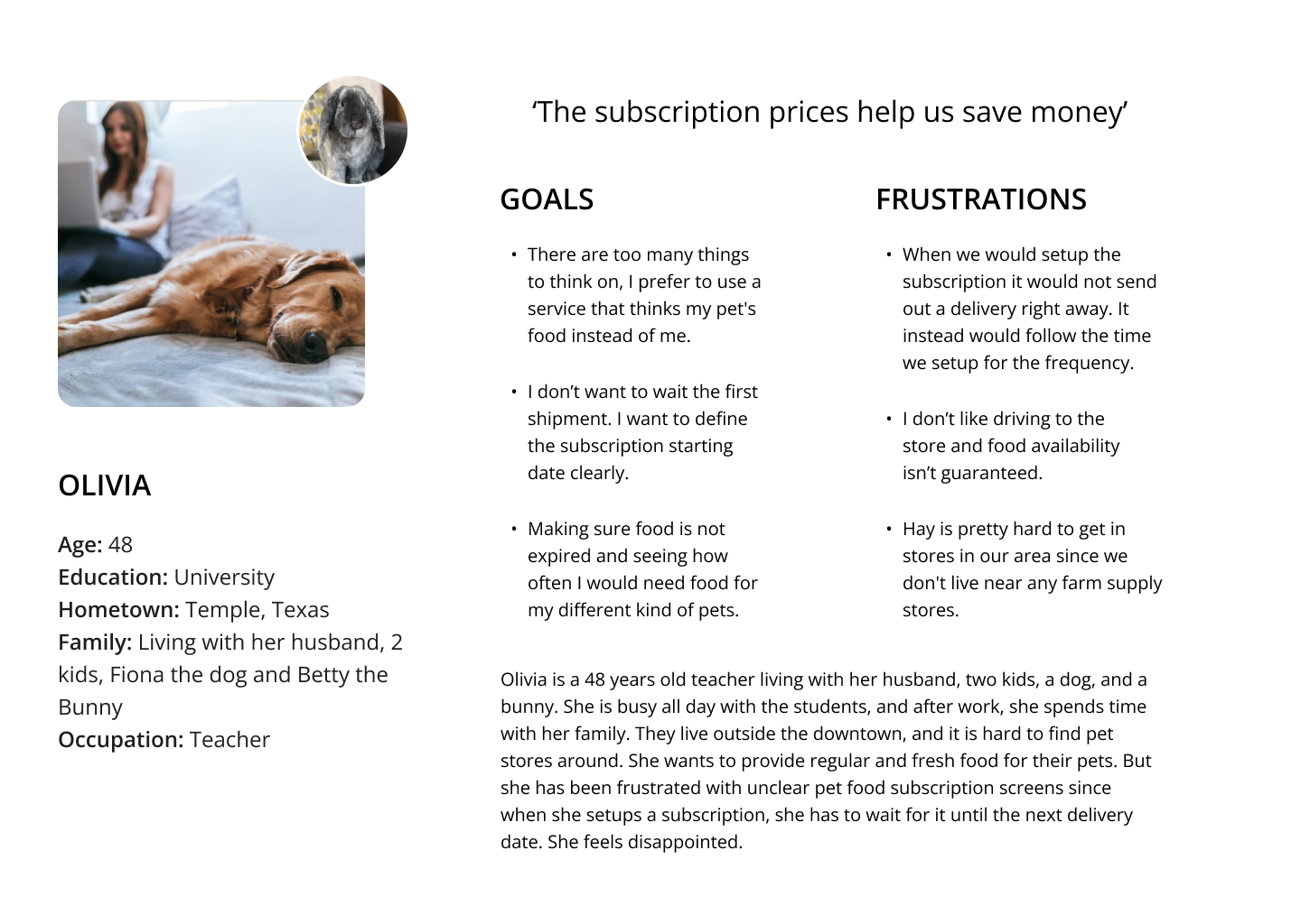
Persona
Problem Statement
Olivia is a busy teacher and mother living outside of the downtown who needs to easily schedule pet food delivery because she wants to spend more time with her family; she doesn’t want to spend time and gas driving far to reach pet stores.
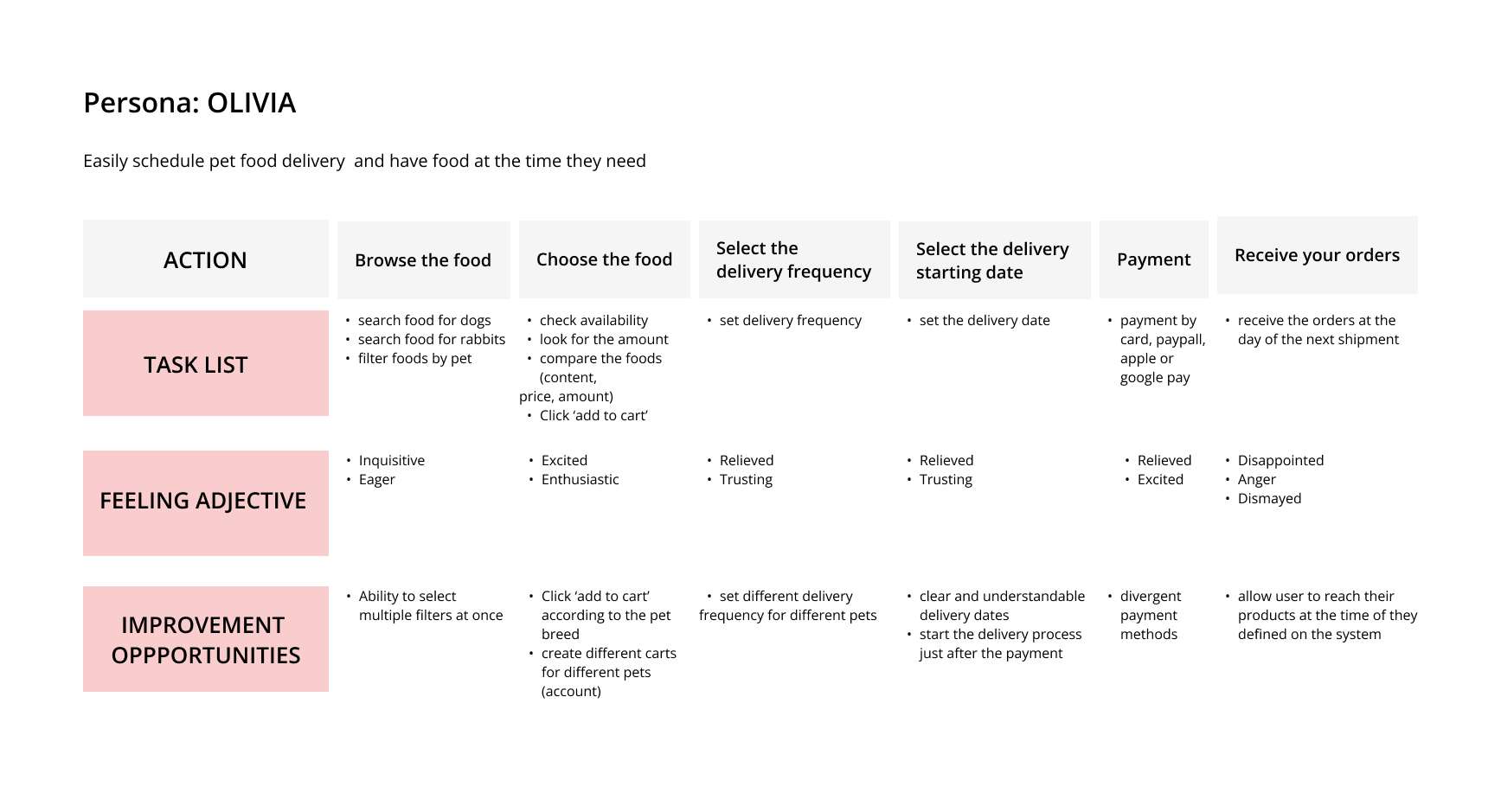
User Journey Map
I created a user journey map of Olivia’s experience using the site to help identify possible pain points and improvement opportunities.
Starting the Design
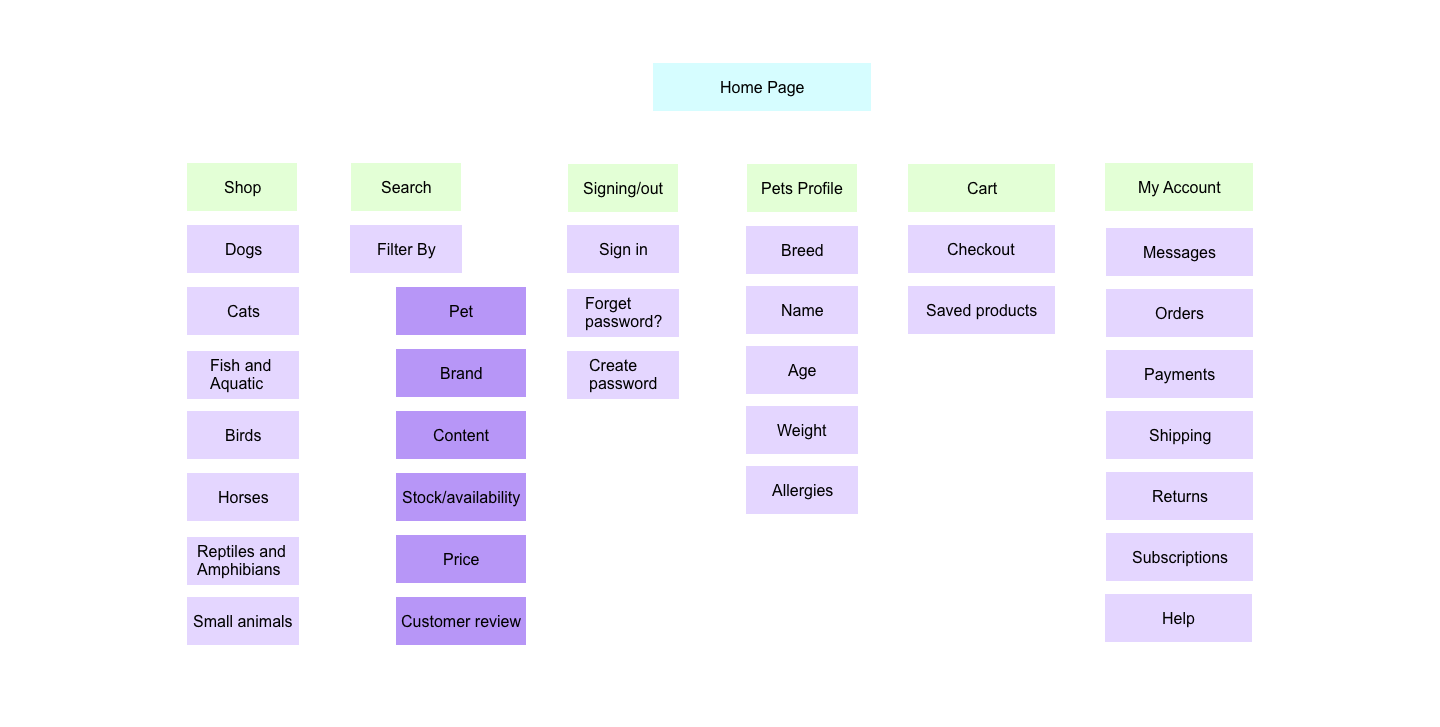
Sitemap
The primary challenge users faced with subscriptions informed my approach in crafting a sitemap. In this endeavor, my objective was to enhance the website’s overall navigation through strategic information architecture choices.
The structure I devised aimed to prioritize simplicity and ease of use.
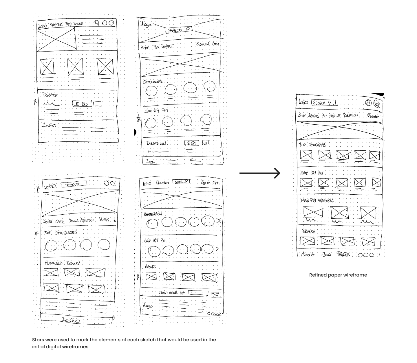
Paper Wireframes
Subsequently, I created paper wireframes for every screen in my application, considering the user’s concerns related to navigation, browsing, and the checkout process.
The paper wireframe iterations on the right side primarily concentrate on enhancing the browsing experience for users on the home screen.
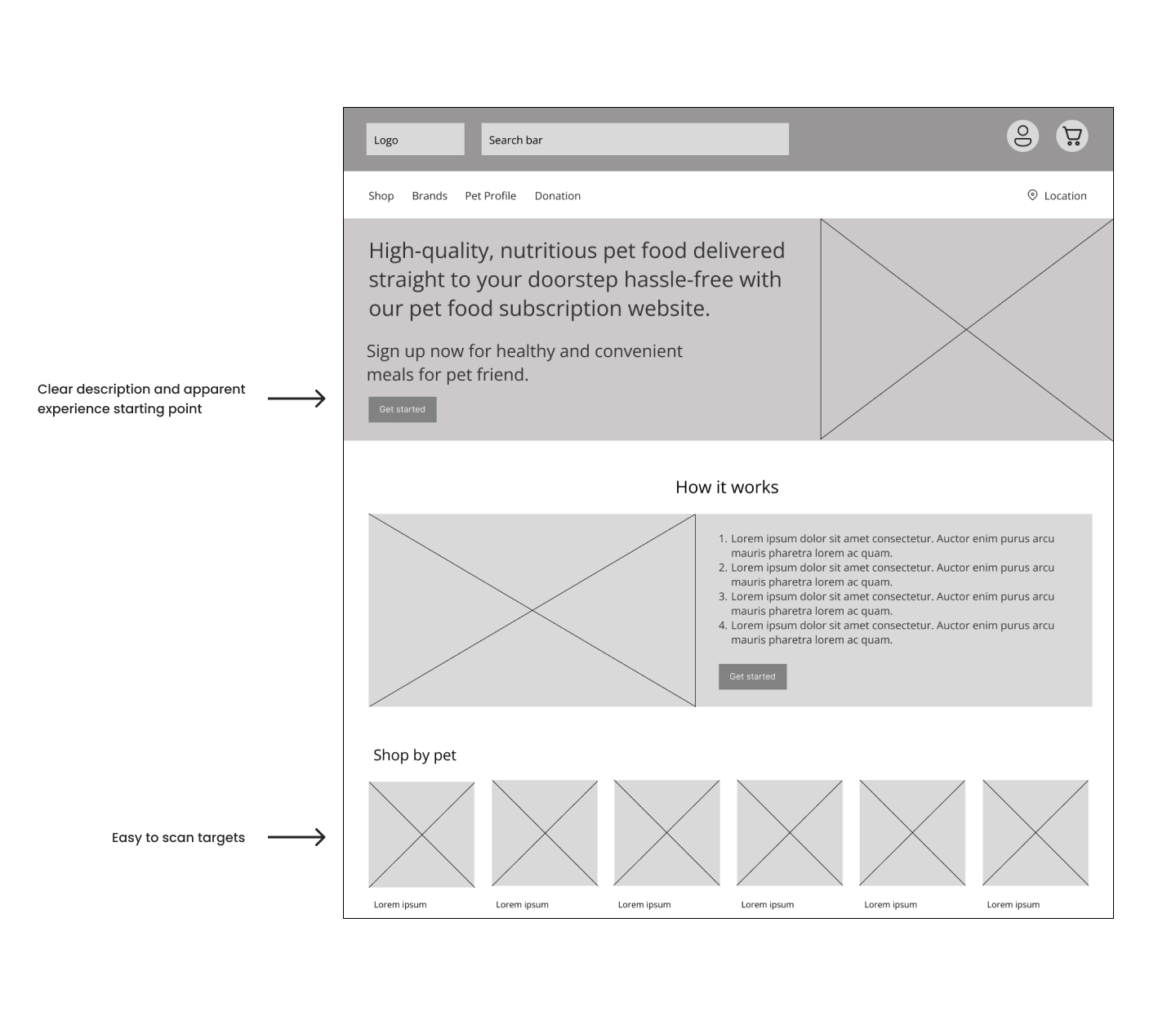
Digital Wireframes
Transitioning from paper to digital wireframes facilitated a clearer comprehension of how the design could effectively tackle user pain points and enhance the overall user experience.
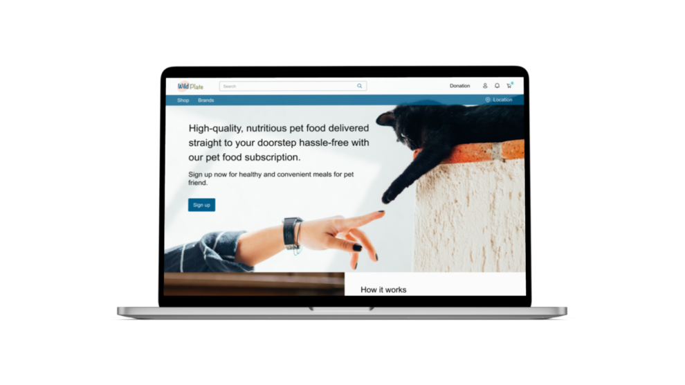
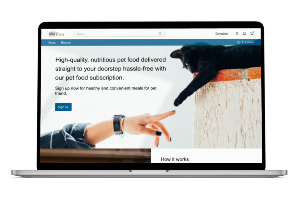
An essential aspect of my strategy involved prioritizing the placement of functional buttons and visual elements on the homepage.
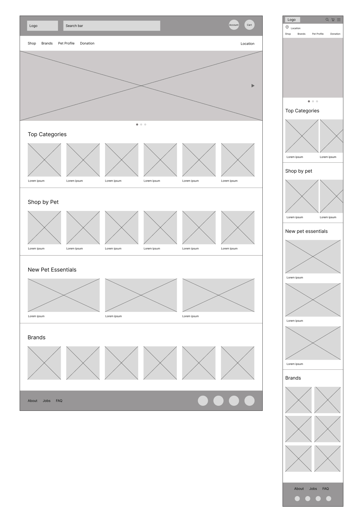
Digital Wireframes Screen Size Variations
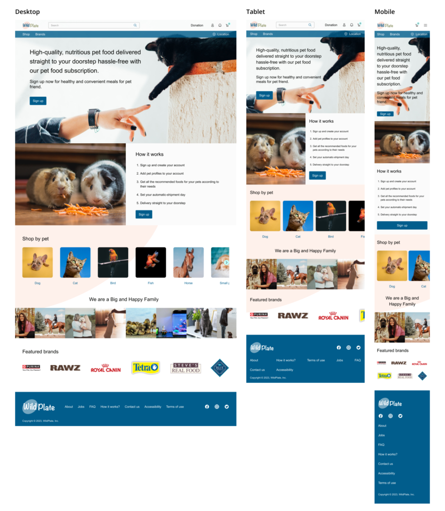
WildPlate should be available on a wider range of screen sizes, allowing users to place orders from anywhere. Therefore, the website should be designed to be fully responsive.
Low-Fidelity Prototype
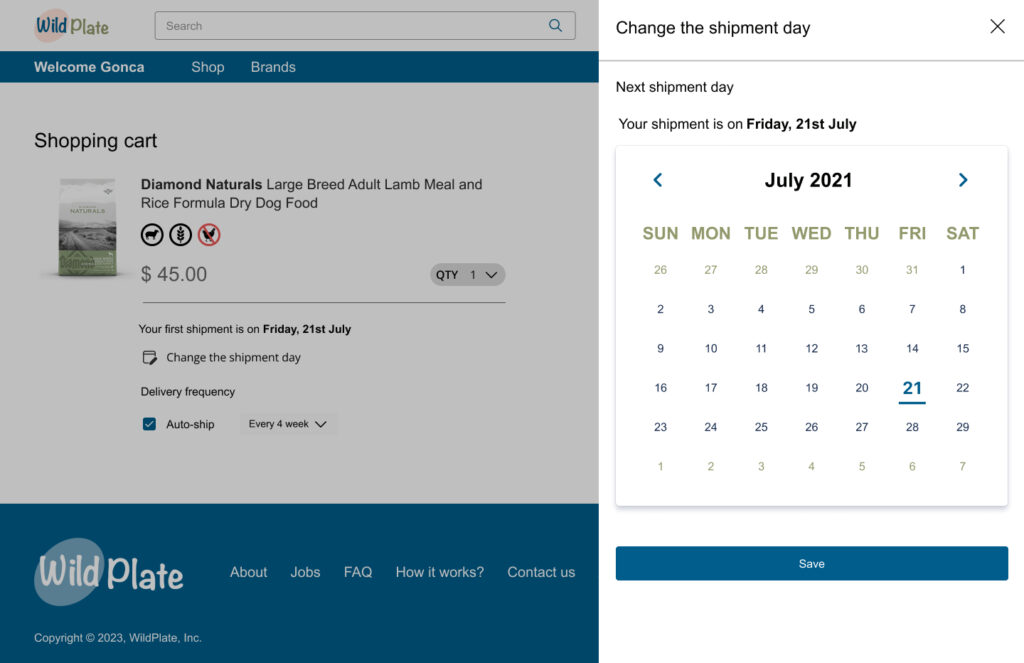
To develop a low-fidelity prototype, I linked all the screens that constitute the user journeys of setting up a pet profile, adding an item to the cart, completing the checkout process, changing the shipment day, and the donation process. I divided the whole experience into chunks to make these flows more consumable.
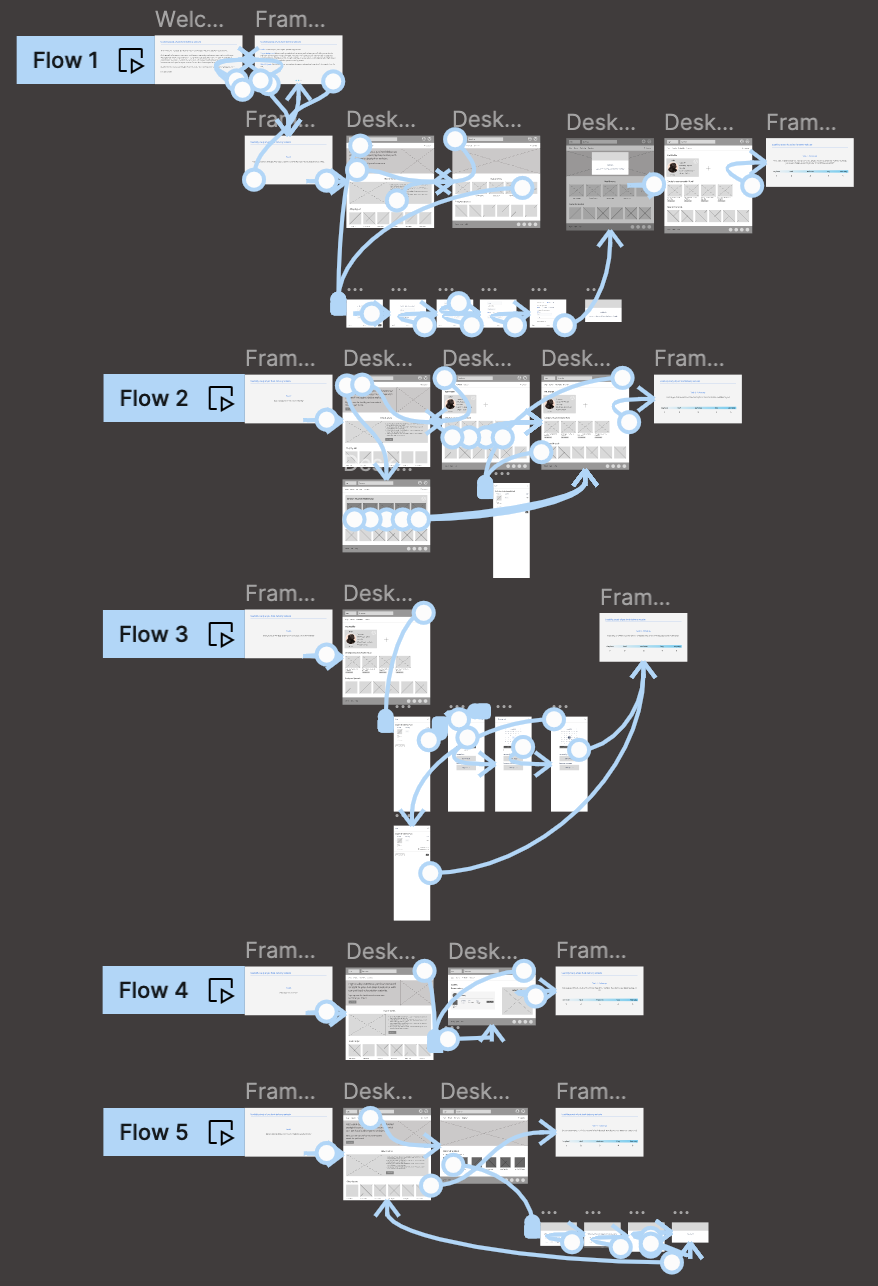
Click here to view Figma flows
During this phase, I received input on my designs from my team members, focusing on aspects such as button placement and page structure. I ensured that I attentively considered their feedback and incorporated several recommendations to alleviate user pain points.
Usability Study: Parameters
These are the main findings uncovered by the usability study:


Usability Study: Findings
These were the main findings uncovered by the usability study:
Refining The Design
Mockups
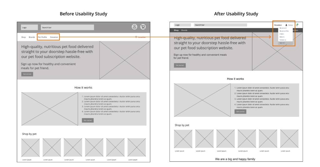
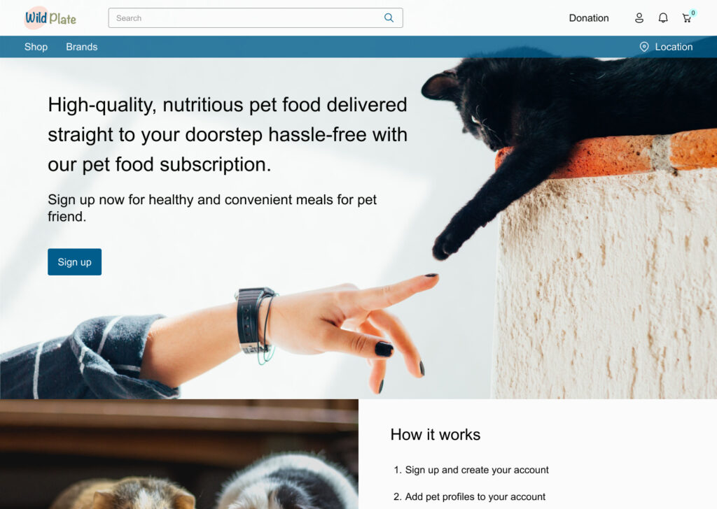
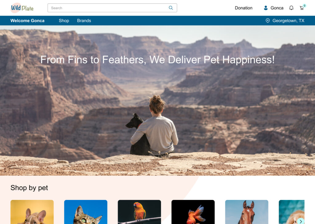
Based on the insights from the usability study, I made several changes and to improve the site’s overall experience. One of the changes I made was removing adding ‘Pet profiles’ and ‘Donation’ from navigation bar. Since users looked for ‘Pet profiles’ under user icon on the masthead, I moved it into the user dropdown menu. Also ‘Donation’ tab is moved to masthead level and separated from the main purchase flow.
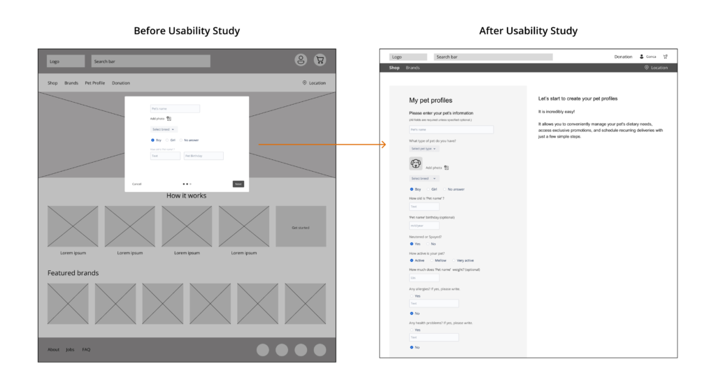
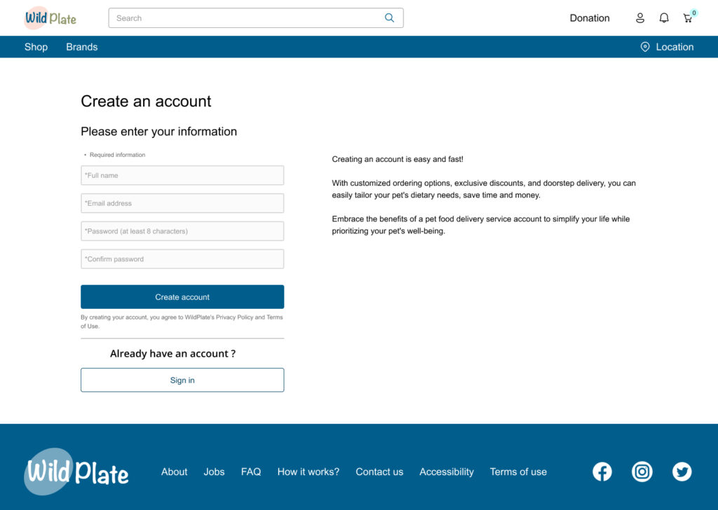
To make setting up pet profile flow easier for users, I left giving information in the modal idea and prepared a one-page form. In this new improvement, users don’t need to recall what they put into the forms, and they don’t need to click back and forth. Everything will be available on the same page.
High-Fidelity Mock Ups & Prototype
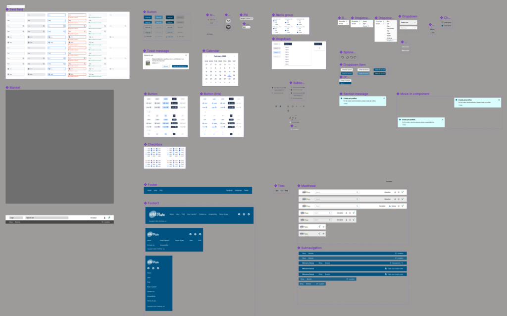
I revised certain sections of my high-fidelity prototype, incorporating the design modifications derived from the usability study. While working on low-fidelity prototypes, I initially employed the Atlassian Design System. However, I observed that in certain areas, it did not align with my project’s requirements. Consequently, I developed a project-specific component library, color palette, and text styles. Additionally, I utilized the Microsoft Fluent Library for icons.
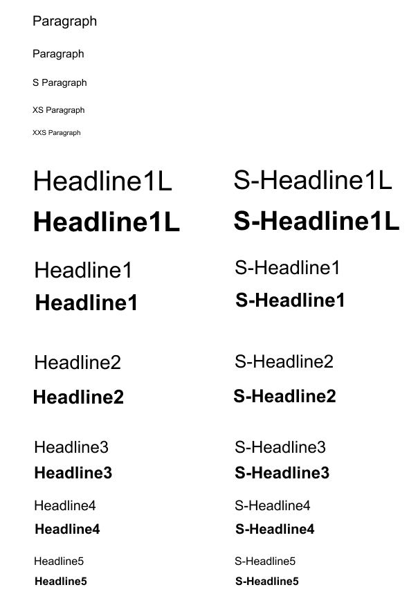
Text Styles
In this project, I used ‘Arial’ as a font. Text styling was arranged according to where the text will be used in the project.
Component Library
I used micro-interactions on the component level while creating UI elements to keep the consistent interaction on my prototypes. I find this method very useful to set up clear prototypes with fewer frames.
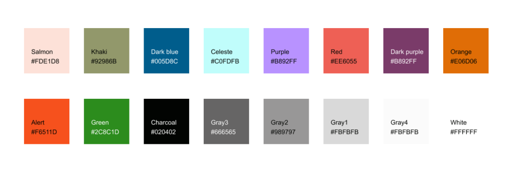
Color Library
High-Fidelity Mockups: Original Screen Size
Please view the recording of the user flow below.
High-Fidelity Mockups: Screen Size Variations
In my mockup designs, I incorporated provisions for various screen sizes, building upon the wireframes created earlier. Recognizing that users shop from a diverse array of devices, I believed it to be crucial to enhance the browsing experience for a spectrum of screen sizes, encompassing mobile and tablet devices, in order to ensure users enjoy the most seamless experience possible.
Accessibility Considerations
Going Forward
Takeaways


Next Steps
- Conduct follow-up usability testing on the new website.
- Detect any extra areas requiring attention and brainstorm innovative features.
- Iterate on flows if there is a need after follow-up usability testing.